Lesson 12: Styling with CSS - The Art of Web Aesthetics
Prefer to listen to this lesson? Click below.
Introduction to CSS:
Introduction
Welcome to Lesson 12 of the 24/7 Teach Full Stack Software Engineering Course! So far, we've explored the intricacies of programming languages, algorithms, data structures, and even dabbled in HTML. This week, we shift our focus toward aesthetics, a critical part of web development, by diving deep into Cascading Style Sheets (CSS).
In this week's lesson, you'll learn how to breathe life into your HTML code by adding colors, layouts, fonts, and much more. Not only will your websites look more appealing, but they will also become more user-friendly and accessible.
Learning Objectives
By the end of this week, you'll be able to:
Understand the basics of CSS and its importance in web development.
Differentiate between inline, internal, and external CSS.
Utilize CSS selectors, properties, and values to style a webpage.
Implement responsive designs using CSS Grid and Flexbox.
Add transitions and animations to your webpage.
What is CSS?
CSS, or Cascading Style Sheets, is a stylesheet language used to describe how a document written in a markup language like HTML will look. CSS can control a variety of visual aspects of a page, from the layout to colors, fonts, and even animations.
Why use CSS?
Separation of Content and Design: This allows for easier maintenance and better website performance.
Reusability: You can apply the same styles across multiple HTML pages.
Accessibility: Make websites more accessible to those with disabilities.
Responsiveness: Make your webpages look good on all screen sizes.
Types of CSS: Inline, Internal, External
Inline CSS
Here, the CSS is applied directly within the HTML tags using a "style" attribute.
html<p style="color: red;">This is a red text.</p>Internal CSS
You define all the styles within the <style> tags in the HTML document's <head> section.
html<head> <style> p { color: red; } </style> </head>External CSS
You write your styles in a separate .css file and link it to your HTML document.
html<head> <link rel="stylesheet" href="styles.css"> </head>Core Concepts: Selectors, Properties, and Values
Let's understand these using an example.
cssp { color: red; font-size: 16px; }Here, p is the selector, color and font-size are properties and red and 16px are their respective values.
Responsive Design with CSS Grid and Flexbox
Flexbox and Grid are layout models that provide an easier and cleaner tool for setting up layouts, aligning content, and distributing space within a container, even when the sizes are unknown or dynamic.
Flexbox Example
css.container { display: flex; justify-content: space-between; }Grid Example
css.container { display: grid; grid-template-columns: 1fr 1fr 1fr; }Transitions and Animations
cssbutton:hover { background-color: blue; transition: background-color 0.5s; }Going Deeper Into Selectors
Let's dig deeper into CSS selectors to better understand their capabilities:
Element Selector
Targets all elements of a particular type.
cssp { color: red; }ID Selector
Targets a single, unique element.
cssC#myElement { font-size: 24px; }Class Selector
Targets multiple elements sharing the same class.
css.myClass { border: 1px solid black; }Pseudo-class Selector
Targets elements based on their position or state.
cssa:hover { text-decoration: underline; }Combinators
You can use various combinators like descendant (space), child (>), adjacent sibling (+), and general sibling (~) to target elements more precisely.
cssdiv > p { margin-left: 10px; }The Box Model
Understanding the box model is crucial in mastering CSS. The box model describes how the layout of each HTML element can be controlled through CSS.
Content: The actual content of the box.
Padding: The space between the content and the border.
Border: The outline of the padding and content.
Margin: The space between the border and other elements.
css.box { padding: 10px; border: 2px solid black; margin: 20px; }Responsive Design: Media Queries
Media queries enable you to apply CSS rules based on device characteristics, like width and height.
css@media (max-width: 600px) { body { background-color: lightblue; } }Preprocessors: SASS, LESS
As you get more comfortable with CSS, you might find that you are writing a lot of repetitive code. This is where CSS preprocessors like SASS and LESS come in handy. They allow variables, nesting, and functions in your stylesheets.
CSS Frameworks: Bootstrap, Tailwind, and More
While writing CSS from scratch is beneficial for learning and highly customizable, sometimes we need to speed up the development process. This is where CSS frameworks come in. Tools like Bootstrap and Tailwind offer predefined classes that apply various styles, making it quicker and easier to develop sleek, responsive designs.
Why use a Framework?
Rapid Development: Start your project with a base template.
Consistency: Create a unified look and feel.
Cross-browser Compatibility: Frameworks often handle the dirty work of ensuring that styles render consistently across browsers.
Example using Bootstrap
Here's how you can make a button using Bootstrap.
html<button class="btn btn-primary">Click Me</button>CSS Best Practices
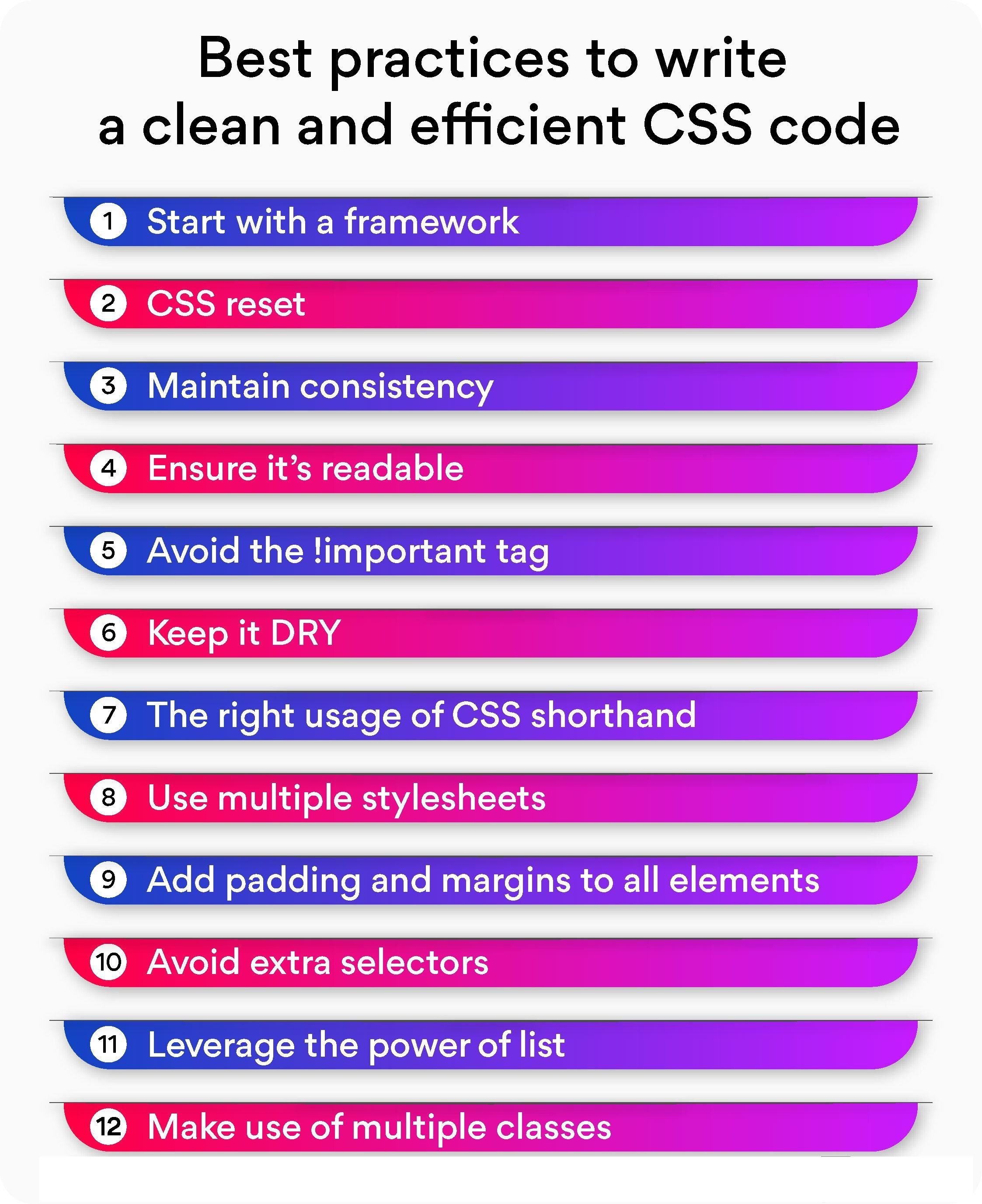
As you're diving into the world of CSS, it's easy to get lost in the styling and forget about maintainability and performance. Here are some best practices to keep in mind:
Modularity: Keep your CSS modular; one way to achieve this is by using methodologies like BEM (Block Element Modifier) or SMACSS (Scalable and Modular Architecture for CSS).
Comments and Documentation: Keep your code well-commented. It helps not just you but also others who might be working on the same project.
Optimization: Avoid using too specific selectors that can make your stylesheet hard to manage. Also, consider minifying your CSS for production.
Animations and Transitions
Let's add a wow factor to your 24/7 Teach landing page with some animations and transitions.
css.button-hover:hover { transition: background-color 0.3s ease; background-color: green; }You can use CSS animations to add more complex sequences. For example, you might want to add a loading spinner or animate an SVG graphic.
Task:
Implement at least one CSS transition or animation into your 24/7 Teach landing page.
Version Control: Git for Stylesheets
Even CSS files can become complex and hard to manage as a project grows. It's a good practice to keep your stylesheets under version control using Git, just like you would with your JavaScript or backend code.
Task:
Initialize a Git repository and make commits as you add new features to your stylesheet.
Final Thoughts
By the end of this week, you'll see how CSS can drastically improve your web pages, both aesthetically and functionally. A well-styled site not only appeals to users but also helps improve the site's accessibility and usability. Remember, a good full-stack developer knows not just how to make functional applications but also how to make visually appealing interfaces.
Please watch the Lesson Video for more guidance:
Additional CSS Resources:
Please click the link below to access additional CSS reference resources:
It's time to test our understanding and engage in an insightful discussion.
Lesson Questions: Please answer each question below and be ready to explain your answers.
Project: Enhancing the 24/7 Teach Landing Page with CSS
Project Overview
Building on your Week 5 projects, you will now enhance the 24/7 Teach landing page by applying CSS styles to make it visually appealing and engaging. Use your creativity to style elements like headings, paragraphs, images, lists, and the form you included.
Requirements
Typography: Use CSS to style the headings (
<h1>, <h2>, etc.) and paragraphs (<p>). Experiment with different fonts, sizes, and line heights.Layout and Spacing: Use CSS to control the margin, padding, and overall layout. Aim for a design that's both appealing and easy to navigate.
Colors and Backgrounds: Choose a harmonious color scheme and apply background colors or images to enhance the visual appeal.
Interactivity: Implement hover effects on links, buttons, or form elements to improve user experience.
Responsive Design: Make your landing page mobile-friendly by employing responsive design techniques.
Extended Features
Use CSS variables for easier theme management.
Implement CSS animations to highlight certain aspects of the page.
Experiment with CSS Grid or Flexbox to arrange page elements more efficiently.
Evaluation Criteria for the Project:
Effective use of CSS to enhance usability: 40%
Creativity and design: 30%
Code cleanliness and organization: 20%
Responsiveness: 10%
This project aims to provide you with experience in styling a functional web page, making it a perfect addition to your portfolio. Good luck, and let's start coding!
Submission Deadline
Submit your extended project by EOD, next Wednesday at 8 p.m., ET. Make sure to test all the features on various devices and screen sizes before submitting.
Reflection Presentation:
After completing the project, take a moment to reflect on what you've learned. Develop a presentation with your answers to the following questions:
What did you find challenging and why?
What about this topic intrigues you the most?
Did you use AI within your project? Where in your project, and what did you learn from the information the AI resource provided?
What did you learn about yourself?
NOTE: Include visuals and specific details in your answers.
Add the link to your completed reflection presentation above.
Participate in the Group Discussion:
Please answer the discussion question in the comment section below.
What are your thoughts on the use of
!important? Did you find a situation in your project where it seemed necessary?


