Tutorial 2: How to Develop Empathy and Define UX Problems
Workshop Scenario:
Place yourself in the following scenario as you work through this tutorial.
The recruiting team at 24/7 Teach was impressed by your understanding of UX and UI design and offered you the UX design position. They were particularly excited about your knowledge regarding UI's role in well-designed digital products. Your first order of business in this new position will be to better understand the audience you will be designing for. This is done through developing empathy. Empathy is an essential step in the design thinking process. It allows UX designers to define the problem users of a product are experiencing and develop an effective design solution. To meet this end, you will need to:
Understand common user research methods
Understand how to organize data into an affinity chart.
Create “ How Might We” statements
Your objective for today: Explain why empathy is critical for good UX design.
Important Questions to Ask While Reading:
To be successful in this tutorial, you need to be able to answer these important questions:
How does empathy assist UX designers in creating a user-centered design?
When should I select one research method over another?
Quick Review
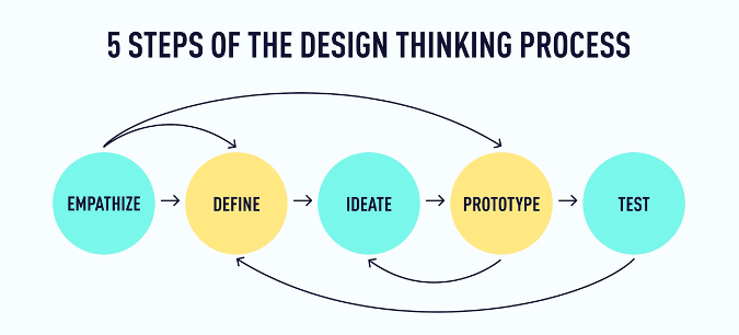
The design thinking process comprises five stages: empathize, define, ideate, prototype, and test. While the process for any given project will almost always require work in each stage, it won’t always happen in this order, and you’ll usually find yourself taking projects back to one stage or another. Remember the meditation app example in Tutorial 1? Just because you’ve finished the testing stage doesn’t mean you won’t do more research, prototyping, and testing until you have the designs ready! The idea is to keep iterating and improving until you find just the right solution for your users.
For UX designers, the design thinking process becomes second nature—so it’s less of a sequence to follow and more a state of mind or an approach to looking at (and improving) user experiences. However, when beginning your journey into UX design, it can be helpful to follow the process in a particular order.
In this UX design tutorial, we’re going to look at the first two stages of the process: empathize and define.
Empathize and Define: An Introduction to the First Two Stages of the Design Thinking Process
In the first stage of the design thinking process, the focus is on connecting with the needs, goals, and pain points of the people who (will) use the product you’re designing. In other words, instead of taking a wild guess at how you should design or improve a product, you find out from the people who use the product what the real problems or pain points are by conducting research. This will allow you to empathize with your audience, meaning you can understand the problems the user is facing. Once you’ve cultivated this empathy and have a clear understanding of where your users are coming from, you can move on to the next stage.
In the second stage, you can more clearly define the problem, goal, or pain point that will guide your design process. The goal here is to determine the problem as precisely as possible without limiting the solutions you might come up with in the next stage.
It’s not uncommon for the lines between these stages to get a little blurry. Sometimes, the problem becomes apparent as you’re researching or as you’re distilling research data into deliverables like user personas or journey maps (we’ll talk more about this in a moment). Other times, the problem will become apparent in a design thinking workshop just as you start brainstorming ideas. And sometimes, the problem (or your understanding) will change later in the design process, prompting you to go back and research or ideate some more—and that’s okay! For now, we will dive more into what empathy looks like in UX design.
Empathy in UX Design
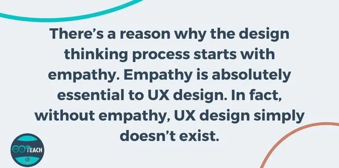
There’s a reason why the design thinking process starts with empathy. Empathy is absolutely essential to UX design. In fact, without empathy, UX design simply doesn’t exist.
Why? Because great user experiences come from listening and understanding the needs of the people who will use or engage with the product, you’re designing.
Have you ever used an app or website and gone away from the experience feeling really happy, satisfied, or even delighted by it? More than likely, the designers behind that product took the time to really understand what their users wanted from the experience. Great user experiences rarely happen by chance! They are the result of an intentional and iterative process, with empathy at its foundation. Of course, business goals are also a factor, but the best UX designers know how to strike a balance and keep their users at the front and center of design decisions.
So what does empathy look like in UX design? Two words: user research.
User research puts UX designers in touch with people who actually use the product and provides insight into users’ needs, goals, pain points, and contexts. This research can take many forms, both qualitative and quantitative. Here are a few methods that are most commonly used by UX designers (not by any means an exhaustive list):
Qualitative research methods
● User interviews (by far the most common)
● Focus groups
● Shadow sessions
● Diary studies
Quantitative research methods
● Analytics
● Mouse heatmaps
● Funnel analysis
● Cohort analysis
● A/B testing
User surveys are another common research method in UX design and can be used to gather qualitative and quantitative data. Because most survey platforms (Google Forms, Survey Monkey, etc.) will translate survey results into graphs and charts, you can turn even the most subjective and non-numerical data into something more measurable when you need to.
How do UX designers know when to use one research method over another? The best research method(s) to use will vary depending on the following:
● The type of product you’re working on
● Where the product is in its life cycle
● Who your users are and how much they’re willing to be involved
● Your (team’s) deadlines, capacity, and budget
● What you need to learn about the product and how your users engage with it
Data Analysis
Now let’s analyze a user survey to help us better identify user pain points that will help you in your UX design. The following survey sought to understand the challenges workers experienced working from home. Using a simple 1-10 scale, users were asked to rate their ease of working from home, with 1 being no challenge and 10 being a very challenging experience. What does this data tell us about people’s experience with working from home? Assess yourself using the chart below and respond to the following questions:
What is one observation you can make using this data?
What is one claim you can make with this data?
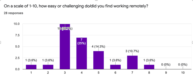
If this were data from a survey you used to pinpoint problems users experienced by working from home, you would have a much better understanding of the challenges workers experienced by working from home. With the data in this chart, you’ll have a more informed sense of users’ needs, goals, and pain points. Generally, when you survey users, they will be responding to a series of questions, which in turn will give you, the UX designer, a richer source of information to comb through, and while this information is critical, what is just as crucial for the UX designer is how the information is organized. This is where UX designers discover trends and identify the problem they work towards addressing through their UX design. Affinity mapping is a popular method UX designers use to organize data obtained from their user research. By organizing this data, UX designers crystalize the overarching issues/problems experienced by users. An affinity map (or affinity diagram) takes all the feedback, data, and insights gleaned and organizes the data into like categories in a visually dynamic way. Affinity maps make it easier to see and understand the significant and overarching problems.
Synthesize User Research
Now that you understand how UX designers use surveys and organize the data collected into affinity groups, let’s cover the necessary steps to create an affinity chart. Below are five steps that outline the process.
Step 1: Get some sticky notes and pens or markers—or set up a board in a free online tool.
Step 2: Go through the survey data and write individual insights, quotes, and other notes. One note per sticky note. It’s okay if some of these feel repetitive or redundant—that’s part of the magic that will help you spot patterns and trends in the data.
Step 3: Peruse the sticky notes and notice similarities, themes, and patterns. Group similar notes together in piles, rows, or whatever makes the most sense to you.
Step 4: Add a sticky note over each pile or row that nicely summarizes and labels all the notes in that group.

Step 5: For each group of notes, add another sticky note (ideally in a different color) that summarizes your key insight or learning regarding that theme or pattern.
Finished! In 5 easy steps, you have an affinity chart and are close to identifying the main issue or problem you will be addressing.
Key Deliverables that Cultivate Empathy and Help Define the Problem
Once the research is done and synthesized, UX designers often create interpretations of the research known as deliverables. These deliverables help you, the UX designer, to:
● Access your research data in one or a few “at a glance” formats
● Turn the research data into something that others can easily understand
● Cultivate empathy for your users among stakeholders and other members of your team, which helps them understand the nature of the problems or pain points under consideration
User Persona
Let’s briefly look at one of the most common deliverables at this stage of the design process: user personas
User personas are concise, research-based character sketches or archetypes representing your users. They’re almost akin to creating a character in a story.
User personas are a great way to synthesize some of your research and make it understandable. They take what might seem like lifeless, overwhelming, or “boring” abstractions and turn them into something more personal and engaging. Because of this, they’re a helpful resource for cultivating empathy and keeping your users at the forefront of design decisions.
While personas are one of the most widely used solutions for humanizing the design process, they have limitations. Designers who include and rely too heavily on demographic information in their user personas or who create just one persona to represent their “average user” are likely to limit themselves and the potential of the products they design. Because your users are individuals who change focus, goals, capabilities, and contexts from one moment to the next, UX designers need to remember that there is no “average user’‘ and that designing for a statistical average or majority will limit the potential of the products and experiences you design.
There are various ways that UX designers address these limitations (including the Jobs-To-Be-Done approach and persona spectrums), but for this course, you only need to be aware that these limitations exist.
How to Define the “Problem” in UX Design
Finally, let’s look at the second step of the design thinking process: define. This is when you clearly and succinctly determine the problem you’ll solve for your users.
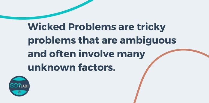
Design thinking is particularly helpful in looking for solutions to what we call “wicked” problems. Wicked problems (a term coined by design theorist Horst Rittel in the 1970s) are tricky problems that are ambiguous and often involve many unknown factors. Solving one aspect of a wicked problem often reveals other problems that need to be solved. Conversely, “tame” problems often have more straightforward or definitive solutions. That’s not to say that “tame” problems are unworthy of a UX designer’s attention—they are still worth addressing and require some work to solve. However, when you approach a wicked problem with design thinking, you find your way into products and experiences with the potential to create change.
One of the many problems that emerged due to the Covid-19 pandemic was how to tend to your mental health amid a global pandemic. This is a wicked problem. And it gets even more interesting if it’s a question that companies ask to find out how they can help their employees or when you add a layer of specificity to it (e.g., how to help frontline workers tend to their mental health).
One way to help narrow your focus and define the problem is through how-might-we (HMW) statements. This might sound complex, but the process is relatively straightforward. You simply look through your user research (or affinity diagram) and start writing HMW statements related to the problems you see represented. For example, a HMW statement for the wicked problem in the previous paragraph might be:
How might we help frontline workers tend to their mental health on their most intense days?
Another way to think about HMW statements is that they frame the main issue identified from user research and help direct the UX designer’s attention to the problem they may focus on solving for users. Based on the data collected from user research and the affinity groups the data is organized into, a UX designer can clearly identify the significant issues or problems users are experiencing.
In case it’s helpful, here are some more specific examples (taken from the user survey results):
● Group A: How might we help parents working from home find accessible and affordable child care?
● Group B: How might we help people who live alone and experience isolation to find connection and support while working remotely?
In the upcoming tutorials, you’ll have an opportunity to craft your own “how might we” statements based on a real-life UX design challenge. We’ll do some ideation in the following UX design tutorial.
Summary
● Empathy is absolutely essential to UX design. No empathy = no UX design.
● User research is the most important way to generate empathy and ensure that you’re designing in ways that serve the actual human beings who will use your product.
● Qualitative and quantitative research are helpful in UX design, but qualitative research can have a far greater impact in the early stages of the design process.
● Affinity diagrams, HMW statements, and user personas are key deliverables that help UX designers translate their research into actionable insights.
● HMW statements are an excellent way to focus your attention on one “wicked” problem at a time.
What to do now
Now you’re ready to jump into the next stage of the design thinking process: ideate. We’ll see you in Tutorial 3!
In the Next Tutorial, You Will:
Learn about UX Ideation techniques.
Tutorial 2: Checks for Understanding
Directions:
Answer the following questions below based on what you’ve learned in this tutorial.
Post your response to the discussion question in the comments section below.
Tutorial 2 Questions:
How would you define empathy based on your understanding of the material covered in this course as it relates to UX design?
Why do you believe affinity charts are commonly used as a popular method for conducting user research?
Discussion Question:
To what extent does empathy allow UX designers to design in a genuinely user-centered way?